关于 RDA(Redundancy analysis 冗余分析)是什么,相信对于已经有可视化需求的同学来说已经不用更多的解释了。
在 R 中常用来进行 RDA 分析和绘制工作的是 vegan 和 ggvegan 这两个包。然而,在实际使用中,最常遇到的问题是虽然这些包内建的 plot 等功能可以绘制出基本可用的包,但想要进一步的定制图形却没那么容易。
想要绘制出一副自己满意、编辑满意、导师满意最主要的是审稿人满意的 RDA 结果,作为最强可视化工具之一的 ggplot2 包毋庸置疑是最佳的选择。
我们需要什么样的 RDA 图
首先,我们来思考我们需要什么样的 RDA 图?按照世纪需求以及审稿人的建议:
I would recommend showing in bold the variables with significant correlations
笔者最后的目标是绘制一幅:
1. 显示物种信息(实际上是响应变量矩阵);
2. 环境变量(实际上是解释变量矩阵);
3. 在两轴上能显示各自的解释度;
4. 标记有显著性的解释变量。
以笔者对 plot.rda 以及 autoplot.rda 这两个 vegan 和 ggvegan 内建函数的浅薄了解,似乎很难完成。
如何「标记有显著性的解释变量」?
如果进行过 RDA 分析不难发现,使用 vegan 内建的 rda 是没有标记解释变量的显著性的。其实这种显著性需要 vegan 内建的 envfit 函数来得到一个及其近似的结果。通常这个方法在论文中会写作:
Monte Carlo permutation (999 permutations) was used to identify axes with significant eigenvalues and species-environment correlations.
由于是进行了 999 次(默认参数可以修改)的蒙特卡洛抽样,因此这个结果是及其近似的结果,直接用作 RDA 中解释变量的显著性是没有问题的。然而,envfit 输出的结果并非标准的 data.frame 或者类似的结果,无法方便的输出或者进行分析,后续我们还会进行结果提取的步骤,暂且按下不表。
RDA 和 ENVFIT 分析
此例,我们使用随机抽取的 150 条土壤线虫群落群落数据以及对应的环境数据,由于不影响后续的理解以及版权考量,对各参数名不再解释。
每一步的操作以及原因以注释的形式呈现。
library('vegan')
library('tidyverse')

# read Environmental Variables
  df_env <- read_csv('../assets/2020-04-28-post/df_env_smp.csv')
# read Community composition matrix
df_com <- read_csv('../assets/2020-04-28-post/df_com_smp.csv')

# View the structure of data
DT::datatable(df_env)DT::datatable(df_com)library('vegan')
# Performing RDA and viewing the results
res_rda <- rda(df_com, df_env)
res_rda## Call: rda(X = df_com, Y = df_env)
##
## Inertia Proportion Rank
## Total 2031.7341 1.0000
## Constrained 895.7317 0.4409 5
## Unconstrained 1136.0024 0.5591 5
## Inertia is variance
##
## Eigenvalues for constrained axes:
## RDA1 RDA2 RDA3 RDA4 RDA5
## 754.0 88.3 45.4 6.2 1.8
##
## Eigenvalues for unconstrained axes:
## PC1 PC2 PC3 PC4 PC5
## 747.4 235.0 96.3 44.7 12.6# Performing ENVFIT
res_envfit <- envfit(df_com, df_env)
# However, the result of ENVFIT is not in the data.frame format, we should extract useful information from it.
res_envfit##
## ***VECTORS
##
## pp ba r2 Pr(>r)
## pH -0.94935 0.31421 0.0809 0.002 **
## MOI 0.79143 0.61126 0.2636 0.001 ***
## TN 0.91399 0.40574 0.0887 0.011 *
## TP 0.86358 -0.50421 0.0002 0.988
## AP 0.99269 0.12071 0.0575 0.015 *
## NH4 0.94495 -0.32722 0.0462 0.033 *
## NO3 0.52786 0.84933 0.1430 0.001 ***
## SOC 0.81629 0.57764 0.1440 0.002 **
## MAT 0.10537 -0.99443 0.0118 0.442
## MAP -0.18615 -0.98252 0.0073 0.570
## PBM 0.75360 0.65733 0.0096 0.499
## PCV 0.57508 0.81810 0.0380 0.070 .
## PSR 0.88521 -0.46519 0.0062 0.645
## ---
## Signif. codes: 0 '***' 0.001 '**' 0.01 '*' 0.05 '.' 0.1 ' ' 1
## Permutation: free
## Number of permutations: 999正如我们在注释提到的,ENVFIT 并不是以 data.frame 的形式提供数据,因此我们还需要通过一些提取的操作才能获得与结果相同的表格。由于这类操作经常使用,因此我们将其包装成 function 并命名为 envfit_to_df。
# Here, env_obj indicates the result of envfit. In this case, it's the res_envfit.
# r2_dig is the significant figure of R2
# p_dig is the significant figure of p value
envfit_to_df <- function(env_obj,
                         r2_dig = 6,
                         p_dig = 3) {
  r2_fmt <- as.character(paste('%.', r2_dig, 'f', sep = ''))
  p_fmt <- as.character(paste('%.', p_dig, 'f', sep = ''))
  tibble(
      # the name of explainary variables
    factor = names(env_obj$vectors$r),
      # list or vector of R2
    r2 = env_obj$vectors$r,
      # list or vector of p values
    pvals = env_obj$vectors$pvals
  ) %>%
    # generate significant levels by p values
    mutate(sig = case_when(
      pvals <= 0.001 ~ '***',
      pvals <= 0.01 ~ '**',
      pvals <= 0.05 ~ '*',
      TRUE ~ ' '
    )) %>%
    # format the significant figure by format definition before.
    mutate(pvals = sprintf('%.3f', pvals),
           r2 = sprintf(r2_fmt, r2))
}
# Convert result of ENVFIT to data.frame, in fact, it's a tibble.
df_env <- envfit_to_df(res_envfit, r2_dig = 3)
DT::datatable(df_env)
截止到目前,我们已经准备完成了 RDA 分析以及 ENVFIT 分析,并将数据转换成为了满足可视化需求的格式。 ## 结果可视化 接下来就是需要进行可视化作业。此例,笔者仅需要显示环境变量与物种信息,不需要显示样地信息,因此绘制中仅保留了所需的信息,如需显示样地信息,请按实际需求更改。
绘制 RDA 图形是常用的操作,因此同样将它包装成为 function 并命名为 ggRDA
# Here, rda_obj means the object which is from vegan::rda
# sp_size means the text size of species
# arrow_txt_size means the environmet variable names at the end of the arrow
# Because not every RDA plot needs indicate significant correlations, the envfit_df is optional here.
ggRDA <- function(rda_obj,sp_size = 4,arrow_txt_size = 4, envfit_df) {
    # ggplot doesn't support rda object directly, we use ggvegan::fortify function to convert the rda to data.frame
    fmod <- fortify(rda_obj)
    # to get the arrow of biplot, we plot rda by vegan::plot.rda function firstly.
    # The arrow attributes contain in the attributes(plot_obejct$biplot)$arrow.mul
    basplot <- plot(rda_obj)
    mult <- attributes(basplot$biplot)$arrow.mul

    # To check if envfit_df exists or not
    # If envfit_df exists, join the fortified rda_obj and envfit to mark which variable is significant.
    if(missingArg(envfit_df)){
        bplt_df <- filter(fmod, Score == "biplot") %>%
        # If there is no requirement to mark significant variable
        # use the sytle of sinificant (black bolder solid arrow)
        # to paint the arrow
        mutate(bold = 'sig')
    } else {
        bplt_df <- filter(fmod, Score == "biplot") %>%
        left_join(envfit_df, by = c('Label' = 'factor')) %>%
        # To mark the significant variables as sig, not significant variables as ns
        # these information are stored in bold column
        mutate(bold = ifelse(str_detect(sig, fixed('*')), 'sig', 'ns'))
    }
  ggplot(fmod, aes(x = RDA1, y = RDA2)) +
    coord_fixed() +
    geom_segment(data = bplt_df,
                 # mult and RDA1/RDA2 are from fortified RDA data.frame
                 # they contain the direction and effects of every variabl
                 # their products are the direction and length of arrows
                 aes(x = 0, xend = mult * RDA1,
                     y = 0, yend = mult * RDA2,
                     # Use different arrow size to indicate the significant level
                     size = bold,
                     # Use different arrow color to indicate the significant level
                     color = bold,
                     # Use different arrow linetype to indicate the significant level
                     linetype = bold),
                 #############################
                 # Q:Why use three different attibution to control the significant levels?
                     # It is redundancy, isn't it?
                 # A: In fact, it's not easy to recongize the significant level by one kind attribution
                     # Becasue it is not delicate to indicate it with supper bold and supper thin arrow,
                     # by the same logic, high contrast colors are not delicate neither.
                     # As for the line type, some arrow are really short, it's not easy to recognize
                     # weather it is solid or dashed line at all.
                     # To sum up, we use three different attributions
                     # to indicate the same difference to avoid any misleading.
                 #############################
                 # to control the size of the header of arrow
                 arrow = arrow(length = unit(0.25, "cm")),
                ) +
    # Add the text of variable name at the end of arrow
    geom_text(data =  subset(fmod, Score == "biplot"),
              aes(x = (mult + mult/10) * RDA1,
                   #we add 10% to the text to push it slightly out from arrows
                  y = (mult + mult/10) * RDA2,
                  label = Label),
              size = arrow_txt_size,
               #otherwise you could use hjust and vjust. I prefer this option
              hjust = 0.5) +
    # Add the text of species
    geom_text(
      data = subset(fmod, Score == "species"),
      aes(colour = "species",label = Label),
      size = sp_size
    )
}
虽然使用 ggRDA 可以直接绘制图形,但通常为了美观,对于特定的参数还需要进一步的调整。
注意,由于在 ggRDA 中使用了 vegan::plot.rda 绘制图像,所以在下面的调用 ggRDA 会首先绘制一次简易的 rda 图像之后,再显示出 ggplot2 绘制的图形,不影响后续的输出保存。
library(ggvegan)
# Get the amount of explanation by each axis
# gernerally, we choose the first two axes.
exp_by_x <- (as.list(res_rda$CCA$eig)$RDA1)/(res_rda$tot.chi) * 100
exp_by_y <- (as.list(res_rda$CCA$eig)$RDA2)/(res_rda$tot.chi) * 100
ggRDA(res_rda, envfit_df = df_env, sp_size = 5) +
# Generally theme_classic is a good choice to paint a figure
theme_classic() +
# In general, we don't need to show the legend in RDA figure
theme(legend.position = "none") +
xlab(paste('RDA1 (', round(exp_by_x, 2), '%)', sep = '')) +
ylab(paste('RDA2 (', round(exp_by_y, 2), '%)', sep = '')) +
# scale_XXXXX_manual series provide the ability
# to define the style of legend by variable value
scale_size_manual(values = c('ns' = .6,
'sig' = .8)) +
# Q: What's species here? I don't remember their is a significant level which is called 'species'
# A: Indeed, their is no significant 'species'. However,
# the species name in RDA which is generated from geom_text contains colour attribution.
scale_colour_manual(values = c(
'ns' = '#606060',
'sig' = 'black',
'species' = 'red'
)) +
scale_linetype_manual(values = c('ns' = 8, 'sig' = 1))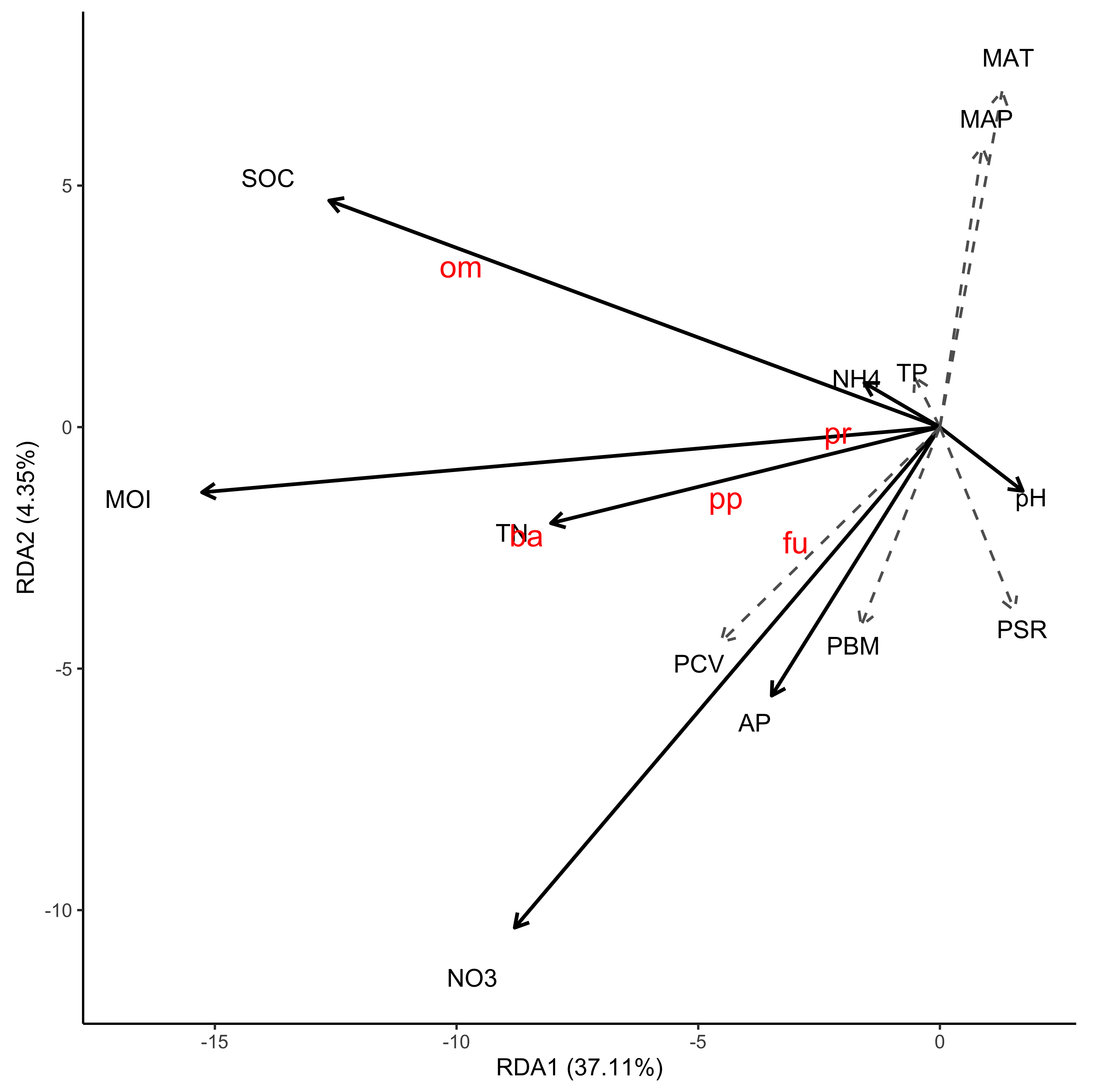 最后很简单了,使用 ggsave 将 RDA 图保存成你需要的格式就可以。
Tips: 自然科学期刊的投稿系统通常支持上传 PDF 格式的图片,根据实际情况也推荐使用 ggsave 输出 PDF 格式。
此时无需设置 DPI 也无法设置 DPI,这是因为,ggsave 保存的 PDF 文件会优先将图片输出为矢量图,简而言之就是图片无论如何放大,都不会变得模糊,而期刊的排版系统也能很好的处理这种矢量图。
只要给 PDF 图片设定一个合适的宽高,就无需担心图片会变得不清晰等奇奇怪怪看似玄学的问题了。
不过如果有修改字体的需求,也许 PDF 会报错,类似于字体无法嵌入,此时输出的 PDF 文件所有的文字都会消失。关于解决这个问题,后续也许会进行进一步的讨论。
ggsave('RDA.pdf',width = 7)